|
We are currently looking for music to go with our piece as an overlay, which will be replaced by the voice of a narrator, and then reintroduced to round off the documentary. We are aiming to find some music which fits with the gaming theme, so we are trying to find a modern interpretation of an old school classic soundtrack. Something like Mario, Sonic, Tetris or Pong would be desirable. Editing is coming along well and our documentary is beginning to take shape, we are working hard to create the most atmospheric and seamless editing possible. Most of our footage is shot with a follow up piece in mind anyway, so if needs be we have a way to link footage if we do not have any cut shots available or it if would not appropriate for a cut shot. We are beginning to think about a voice over, however we are still unsure about how we plan to complete this or who is likely to do it. We do have a script written up though so we are aware of what we want in to consist of. We plan to include this as it is again another fundamental of documentaries.
0 Comments
We are looking to obtain a variety of interviews for our piece as again they are a crucial convention of a documentary. We are looking to work with different backgrounds and people in order to create a depth of information and view points being portrayed. As of now, we have a interview with myself and a specialist, however we plan to find more varying perspectives on the matter.
With editing underway and the poster draft finished, I will begin work on the double page spread. I am a little unsure of how to write for it, and in what context to write however I will do research to understand this further. Double page spreads feature an array of different styles and conventions. For example double page spreads will most likely have a huge, eye grabbing title which essentially gives the focus of the spread, it is usually highly related to the subject of which it is describing. If in magazine form they will also usually feature a date and or magazine logo, this is most commonly seen in the radio times, which is iconic for it's small emblem in the page corners.
I have created a first draft for the poster, we have decided that Channel 4 will be our set design, and so using the style guide I have designed the poster to be as close to the original style as possible. The channel 4 style guide can be found here: http://www.channel4.com/about_c4/styleguide/ Here is the poster as a first draft: 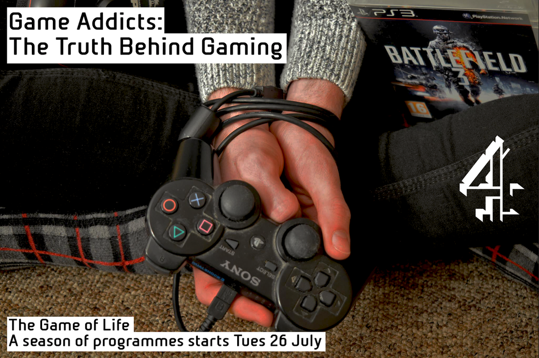 In reference to the style guide, I have used the colour palette provided by channel 4, found a text style almost identical to that off the channel 4 font style, and the structure and positioning is that of which channel 4 use. Here are some examples of posters which i used to further understand what I needed to incorporate within our own poster:
These examples of posters feature similar positioning, colour co-ordination and context. The channel 4 text is always the same, which was essential if i was to create a professional poster to show off our documentary. I worked in accordance with the style guide rules, whilst using other posters to visualise what these rules meant. For example the channel 4 logo always exists in the centre of the page in the far side, and the text is always in either the top left or bottom left corner. Doing this gave us the look of professionalism and consistency. Following ideas from class, codes and conventions from online and ideas from ourselves we were able to create a strong looking poster.
We have filmed more pieces to go in to the documentary, however we are finding that the audio quality in some footage differs from others, and so we are looking in to fixing that through perhaps using a micro-phone or generally keeping track on how to keep audio quality of a similar standard. We are pulling more shots to highlight our technical skill, using things such as Bokeh or focus pulls to really emphasise the shots being taken. This makes a change to having only basic shots.
We are looking for ways to join up footage and create a more seamless effect, from this we came up with the idea of using newscasts about gaming, which are short and sharp and can create a sequence, perhaps for our opening or maybe to follow after an interview.
Looking at our work we have realised we can utilise more archive footage to accentuate our focus, gaming hasn't always been around with it's rise coming up form the early 80's, and there are many adverts and examples of archive footage we could utilise. Here are some examples: these are all possible sets of footage we could use, we may try to incorporate footage from the present day as well as archive footage, to highlight the lifetime of gaming, and with gaming comes the potential for addiction.
We have started editing our piece together and it is coming together very well, we are aware we do not have enough footage for the documentary just yet however we will continue to film once we have edited what we have, just to see what we need and what would be a good idea.
In regards to the poster and double page spread, I plan to start work on those as of the next week. We have began our filming process and are working towards obtaining all the required footage, we are working closely to what our story board was planned to contain. We are cutting somethings out here and there as we do not want our piece to be to long, or have any stale, meaningless footage.
So far we have filmed a time lapse which will act some transition footage, which may have a commentary over it or simply just background music. We are going to try finding music soon as we want to have as many components available once they are in iMovie. this is just so we can see some shape to our film from the get go, and may inspire us to include anything extra. I am also doing research in to the poster and the double page spread so i can get a rough idea of what is needed for those.
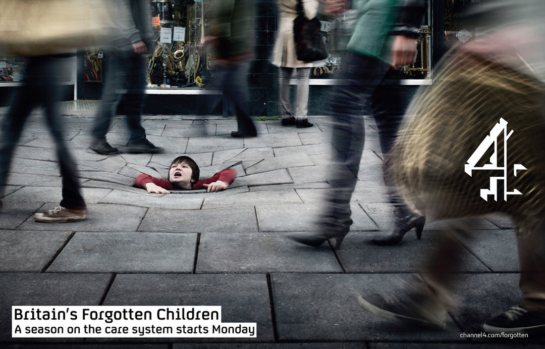 Looking at these examples and the channel 4 style guide I have been planning how I will structure my poster, I plan to use a white colour scheme and a photo which we planned to work in to our actual documentary however we could not find the right moment. I plan to stick to the channel 4 style guide as much as possible to create a professional effect.
|
Archives
April 2016
Categories |


 RSS Feed
