How did you use media technologies in the construction and research, planning and evaluation stages?4/29/2016 
0 Comments
Evaluation Question - "How effective is the combination of your main product and ancillary texts?"4/29/2016 To address this question we have planned out a blog post of which will highlight the content of our main product and ancillary tasks, and how they work together as a set piece. Here are the 3 Pieces we create:
During all three of our pieces we have tried to create a resonating focus which is present in all 3 assets, to do this we worked with codes, conventions and a theme. Our theme was, as the title says, addiction to video games and how it effected individuals. The poster features a topic relevant photo of which we had taken, and edited to make it even more coherent with our subject/broadcaster. We have a dark underlying tone throughout our pieces, which in our poster we made present through a vignette border. To begin with our poster was good however it lacked an edge, which we were able to include through the vignette effect.
The double page spread feature a more lighter tone, however it's core text is all about how addiction can take a life, and what effects this will have on the individual and those around them. We again made use of our own image, which we manipulated to make relevant to our subject, and work with our other two pieces. The title is features throughout all three pieces in some way or form, this creates a sense of consistency in our pieces which can easily be seen. Again research was required to make sure that the combination of our film, poster and DPS was effective and intuitive. Through doing this we received positive feedback, which proved to us that we had made an effective combination. The documentary itself is the most complex task we went through creating, and features the highest point of technical skill we could use. We had this made up first, so that when the time came to create the other two pieces we were ready, and understanding of how to link the set together. This is clearly evident through all three pieces, this an be seen through fonts, dialogue and images. These were all aspects we had in mind to create effective pieces, and create a strong link between all three pieces.
Here is a prezi we created to address the evaluation question of "In what ways does your media product use, develop or challenge forms and conventions of real media products?"
We used prezi to address this question in particular as it creates an interactive session which takes the viewer through our though process and why we included what we did. We address whether or we worked with, or against a convention and why we did so. 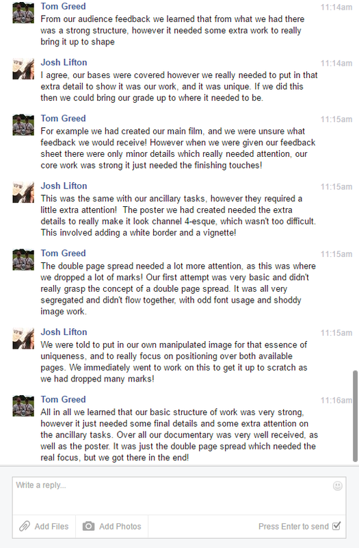 For this evaluation question we used a facebook conversation as a medium of expressing our thoughts on how well we had responded to the feedback given, and what we thought of the feedback given (Whether we agree'd or disagree'd)
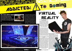
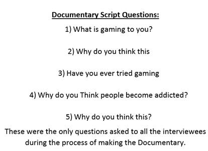
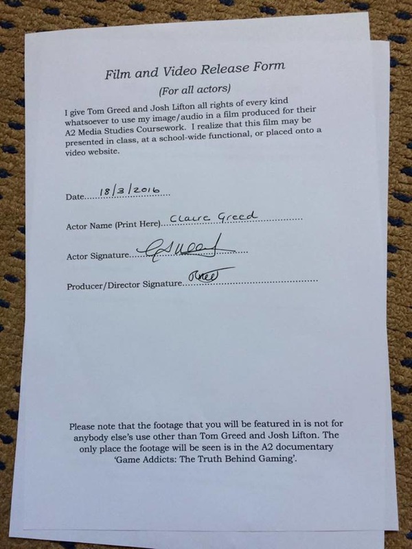
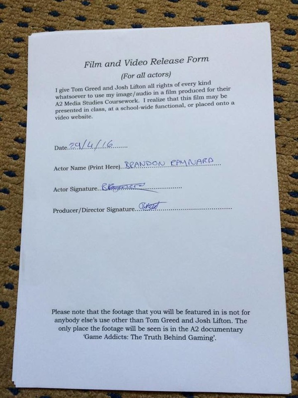
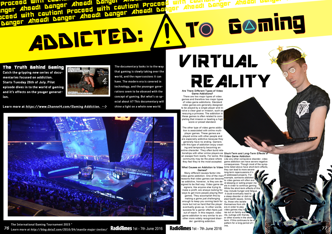
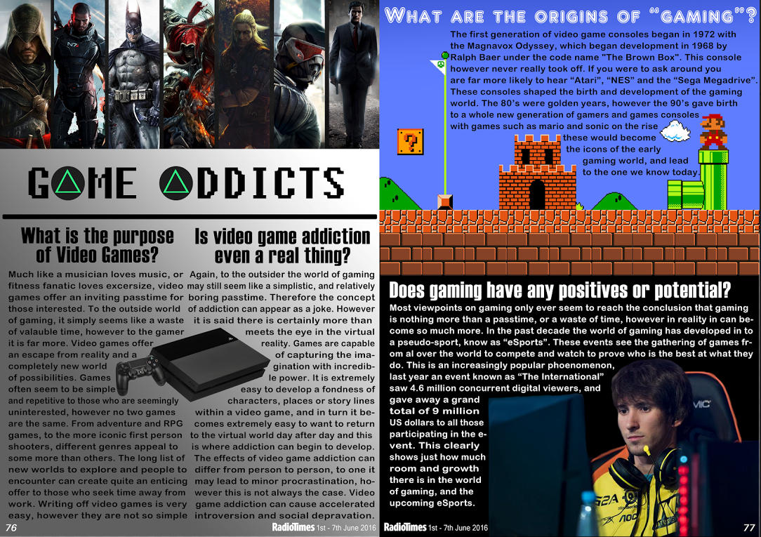
We address how we felt the work we had produced was received and whether or not we did work to improve certain aspects of our work. Here is our final documentary piece. We have worked hard to include any feedback given, and the film has been edited relentlessly to give us the highest chance at a better grade as possible. We were given feedback from peers, class mates and actors in order to make sure that the target audience, as well others might enjoy it's content and feel it worked to the highest degree. We worked hard to co-operate with codes and conventions, and make sure that our film was not off piece. In order to create a strong sense of professionalism we worked hard to make sure our that we used any codes or conventions.  Final Double Page Spread Here is our final double page spread, which features all the codes and conventions researched within other double page spreads from the start of the year. We looked closely at page layout, font usage, titles, sub headings and manipulated photos. All these things considered we were able to create the piece we did, and we are very happy with the outcome. This also drew on our photoshop skills, and how closely we could work to the radio times style guide. 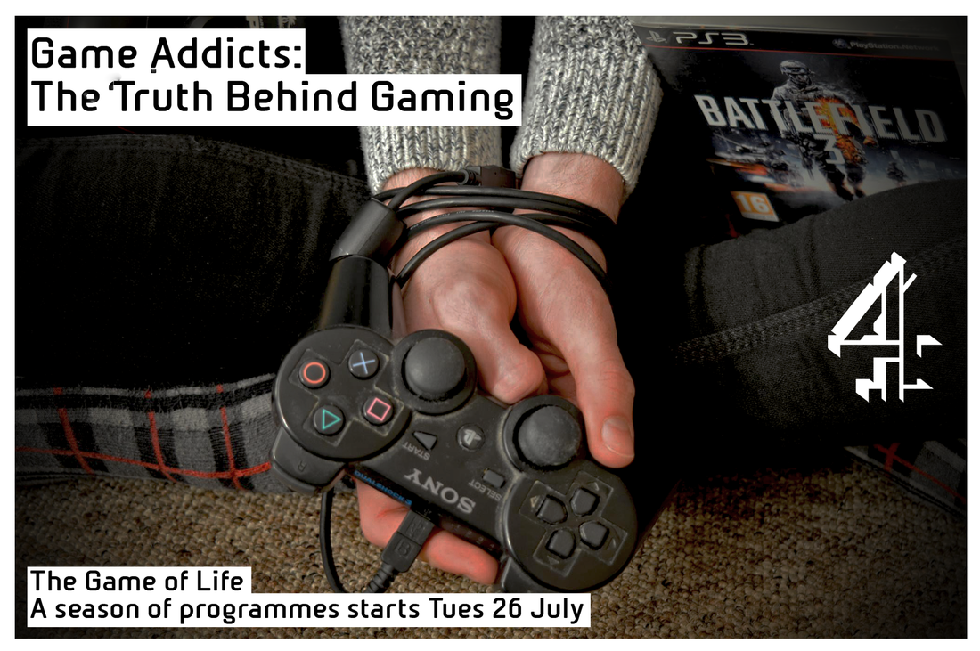 Final Poster
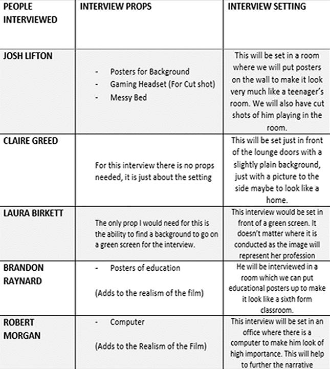
Here is the final poster which we had created as an ancillary task, this was used to highlight and show off an extra focus and that we could work in accordance with a style guide. Our chosen broadcaster was Channel 4, and so we had worked hard to make sure it would turn out as close to an original channel 4 poster as possible. We have done research in to numerous other posters, which gave us an insight in to what our piece should turn out like. We worked with the channel 4 style guide in order to make sure it was as close to an original as possible. This drew on our photoshop skills, and how to work closely to a set style brief. Here are examples of our storyboards, we found these to be a lot less essential in our pieces as we relied highly on free lance ideas and a self developing storyline. These story boards allowed us to generate ideas, however we didn't necessarily stick to them 100%. There are elements which can be see in the story boards, however as said it is not 100% accurate. We did this as we often found ourselves stumbling in to new content which we had not previously thought of, therefore we tended to go off pieces, but we still considered all of our original ideas in combination of the new, unique ideas. These story boards were developed prior to any filming. 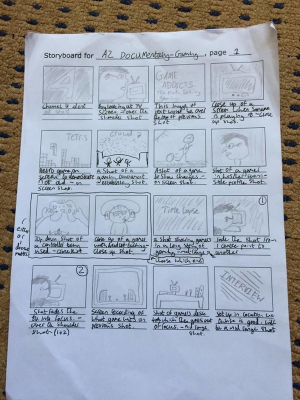 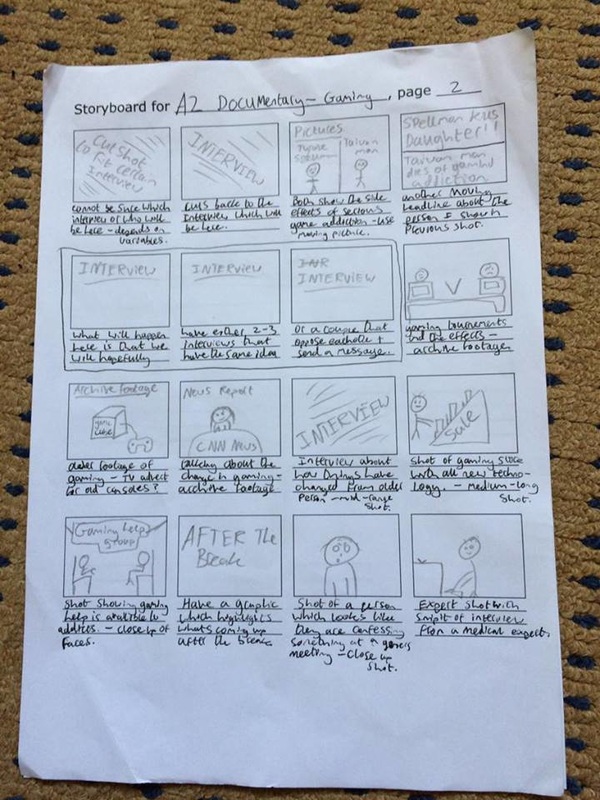 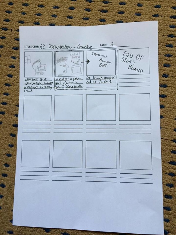
As you can see there is a clear difference between our two pieces, the first attempt was very segregated and did not feature any own images. We had not manipulated any of our own photo's and everything used was taken from off line, it looked more like a poster if anything else. There was some elements of own ideas, for example the title using two triangle buttons to show off the idea of gaming, however it was very limited ideas. The text was all very large and it did not really make the most out of the space given. The feedback we were given fed the ideas for the final piece.
In the final attempt it is easy to see that there is more flow to the piece, and it does not feature a large segregation of text. The spread features a clear use of a manipulated image which we had taken, and i worked by best to make it look related top our focus of gaming addiction. The hands coming up make it appear that the person is being drawn in by the games as he looks dazed and confused. We incorporated our poster in the top left to give an idea of what it might look like, and we then added in hyper links to create a real sense of magazine-ness. By working with the feedback we had been given this allowed me to put together a very strong double page spread. We utilised the radio times logo and page numbers to really give a detailed effect. Poster For the poster we understood that in order to keep the continuity and effect of realism we would have to make it look as close to that of a channel 4 poster as possible. This included the positioning of the text, and the font used to create said text. Finding the text we used was very difficult to get hold of, the channel 4 text is exclusive to the brand and is otherwise untouchable. Mock fonts were very hard to get a hold of as they usually tend to break copyright law, however there was one found with large similarities yet not a straight copy of the channel 4 text. the text we used is called Bold Sans Fms and creates the illusion of a channel 4 poster. Film For the film there is not much text included, it only appears when identifying who is being interviewed and why they are relevant. The text is a stock text from iMovie and is only used due it's clarity and simplicity. DPS For the double page spread there was much more room to manipulate fonts and include a select variety for example the main heading text we used was aimed to look more on the technological side, to fit with our theme. The pixelated look creates that refine link between the focus of our film and the focus of our double page spread. For the main body of text we want to keep it tight and simple in order to give that classic radio times look, the radio times often utilise a similar style font with a basic look as the main body is not the focus, rather the positioning, the image itself and title. It is therefore we have focused on the portrayal of the title, rather than creating to much emphasis on the small text (unless necessary)
 With feedback from our teacher we have worked to improve our poster in order to earn a few extra marks to bump up our grade. First we have added a vignette to focus in on the main image and relate to the dark atmosphere, and we added a white border in order to follow the style of the channel 4 posters.
|
Archives
April 2016
Categories |


 RSS Feed
