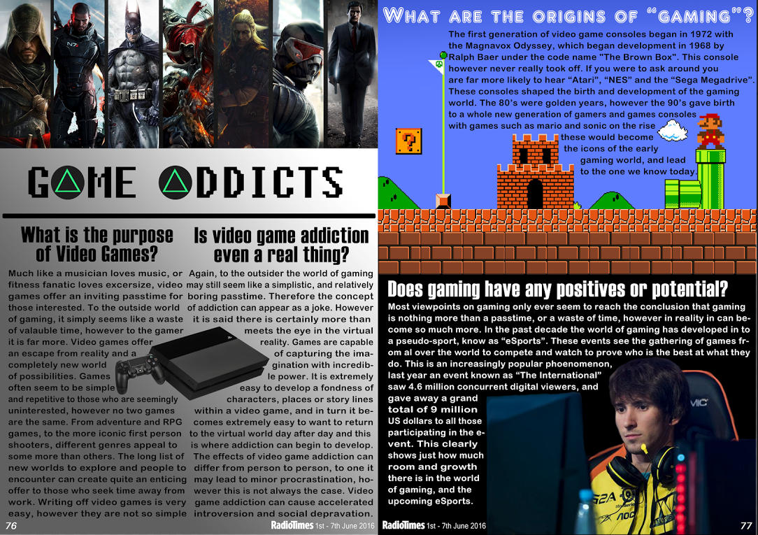
As you can see there is a clear difference between our two pieces, the first attempt was very segregated and did not feature any own images. We had not manipulated any of our own photo's and everything used was taken from off line, it looked more like a poster if anything else. There was some elements of own ideas, for example the title using two triangle buttons to show off the idea of gaming, however it was very limited ideas. The text was all very large and it did not really make the most out of the space given. The feedback we were given fed the ideas for the final piece.
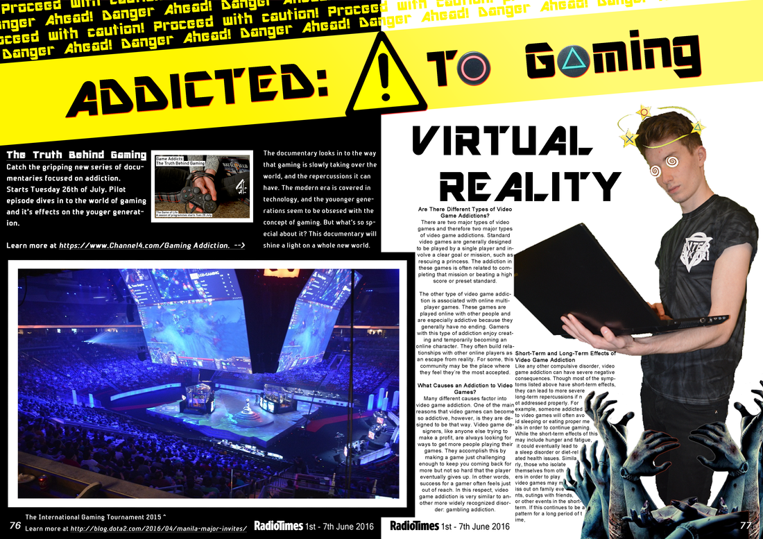
In the final attempt it is easy to see that there is more flow to the piece, and it does not feature a large segregation of text. The spread features a clear use of a manipulated image which we had taken, and i worked by best to make it look related top our focus of gaming addiction. The hands coming up make it appear that the person is being drawn in by the games as he looks dazed and confused. We incorporated our poster in the top left to give an idea of what it might look like, and we then added in hyper links to create a real sense of magazine-ness. By working with the feedback we had been given this allowed me to put together a very strong double page spread. We utilised the radio times logo and page numbers to really give a detailed effect.
0 Comments
Leave a Reply. |
Archives
April 2016
Categories |
 RSS Feed
