|
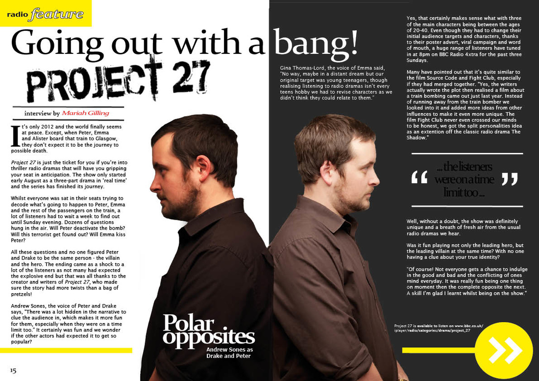
Poster For the poster we understood that in order to keep the continuity and effect of realism we would have to make it look as close to that of a channel 4 poster as possible. This included the positioning of the text, and the font used to create said text. Finding the text we used was very difficult to get hold of, the channel 4 text is exclusive to the brand and is otherwise untouchable. Mock fonts were very hard to get a hold of as they usually tend to break copyright law, however there was one found with large similarities yet not a straight copy of the channel 4 text. the text we used is called Bold Sans Fms and creates the illusion of a channel 4 poster. Film For the film there is not much text included, it only appears when identifying who is being interviewed and why they are relevant. The text is a stock text from iMovie and is only used due it's clarity and simplicity. DPS For the double page spread there was much more room to manipulate fonts and include a select variety for example the main heading text we used was aimed to look more on the technological side, to fit with our theme. The pixelated look creates that refine link between the focus of our film and the focus of our double page spread. For the main body of text we want to keep it tight and simple in order to give that classic radio times look, the radio times often utilise a similar style font with a basic look as the main body is not the focus, rather the positioning, the image itself and title. It is therefore we have focused on the portrayal of the title, rather than creating to much emphasis on the small text (unless necessary)
0 Comments
Leave a Reply. |
Archives
April 2016
Categories |
 RSS Feed
